
WIEDEMANN'S BREWING | Case study
Brand Development and Redirection
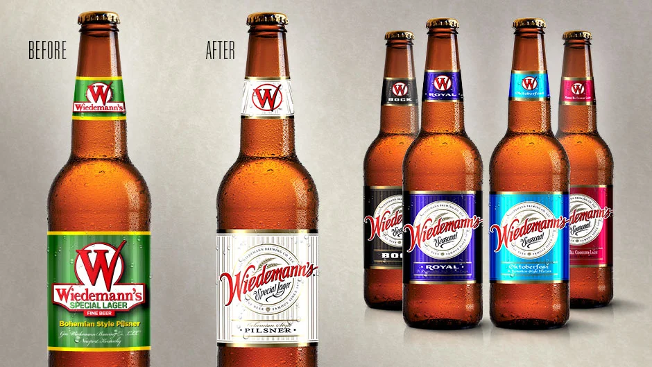
CHALLENGE
Wiedemann Brewing Company’s beer making heritage dates back to the 1870’s. Its authentic Bavarian styled lager established a loyal following on its way to becoming the largest brewery south of the Ohio and east of the Mississippi. The company presented a redesign opportunity to Kennedy Creative that required a comprehensive plan for brand development and redirection. The challenge included identifying brand equity elements over the life of this historic brand, collecting consumer insight data, conceptualization of brand family extensions, and managing the creative production process.
STRATEGIC SOLUTION
The approach began with understanding the rich history of the Wiedemann brand and its impact on the regional beer industry. Brand and historical audits delivered the equity elements that anchored the new brand turnaround: red on white and historical brand slogans were key. Reimaging these core elements resulted in a custom brandmark with black and gold added to convey the sense of history, new style craftsmanship, and premium quality. The brandmark for the new product line incorporates an ownable brand name, wheat illustrations, and “Special Lager” identifier. This standard is consistently used across the brand family and the flavor varieties are identified with prominent color.
RESULT
The new contemporary look was met with enthusiasm from distributors and key accounts; Kroger was one of the first to place orders. The brand launch included event marketing at the Cincinnati Reds opening day ceremonies and taps at several local micro-breweries to build awareness and grow market presence at retail.